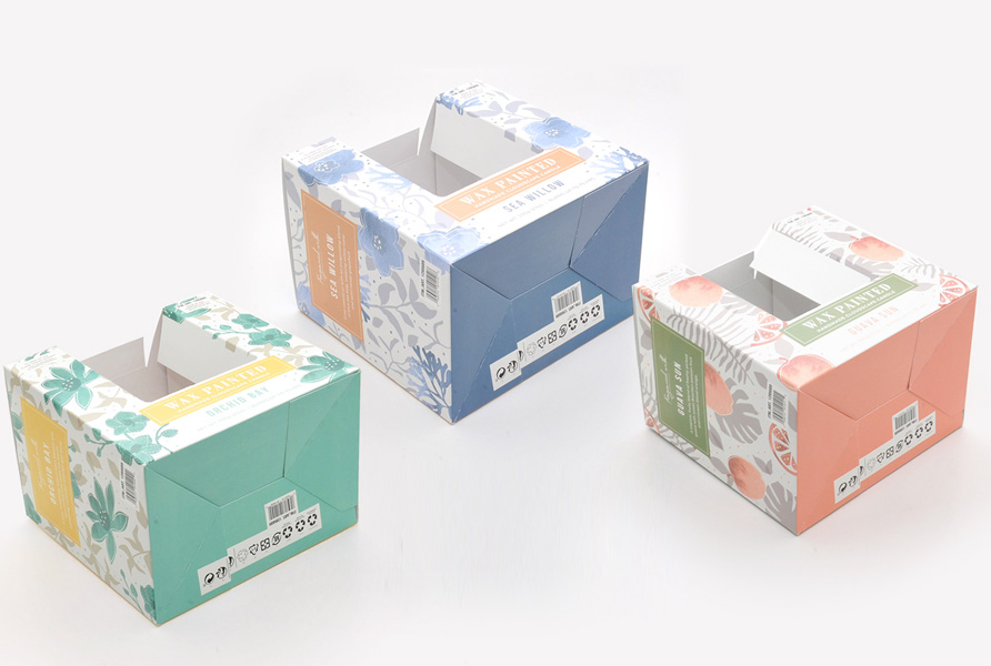
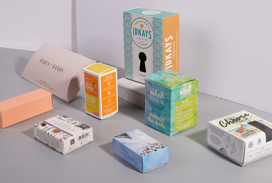
If you have not already adapted your product packaging to appeal to digital shoppers as well as those who buy in-stores, then you should do so as soon as possible. Ecommerce has proven itself to be permanent, and its use continues to increase. But how do you adapt your product packaging to appeal to those online shoppers?
Know When to Adjust Colors
In many cases, you won’t have to make any changes to your product packaging’s colors for eCommerce. In fact, you should avoid making dramatic changes if your colors are already associated with your brand, as this could hurt your branding.
However, there are some exceptions. Metallic colors or colors with special effects, for example, simply don’t translate well on a computer or smartphone screen. They can make the product very hard to see, so you may need to adjust them slightly.
Maintain the Overall Brand Imagery
As mentioned, you should do your best to maintain the colors for your product packaging, whether you sell it online or in-store, due to branding. This also extends to the font, images, and other elements that help customers find your brand.
Consider Your Packaging Vs. the Competitors’
The key difference with digital shoppers is that customers won‘t be looking for your product on a shelf of similar items. Instead, it will be a digital display of similar items. This means that instead of your product being immediately next to a competitor’s, there will be spaces between them. There will also be visible names or descriptions on the page. You will have to think about how this affects your packaging, if at all.
Don’t Over-rely on Multiple Images for Detail
With online purchases, customers can’t pick up and read the labels on your product. To make up for this, the product page will likely include images of all sides as well as written descriptions. It is important to include these, but you shouldn’t rely on them too much when designing your packaging.
Remember that shoppers don’t want to have to click on multiple product pages to compare products. They will if they have to, but if a product has enough information in its thumbnail image, they are likely to just choose that. Or they will just look for a product that grabs their attention and then read the product page to confirm it’s what they want.
Be Eye-catching
Take advantage of this by making sure that the front of your product packaging has a design that will be legible on the screen, preferably as a thumbnail. At the very least, try to make key features obvious at a glance. For example, if you sell a USB drive, include its storage size in a large font.
When in Doubt, Get Inspiration and Feedback
If you are ever unsure whether your product packaging does a good job at appealing to a digital audience, ask your customers or do some market research. You can also get inspiration from competitors to see how they adapt their packaging for online orders, or for how they create packaging that works both online and in-store.


