When you have a product that has packaging that lends itself to being changed periodically, it could be fun to change it seasonally. It’s not too early to begin designing your autumn packaging. Autumn is a lovely time of year replete with warm reds, oranges, and yellows of fall colors. You can make the most of this season by sprucing up your packaging in these lively, vibrant colors.
Types of Products
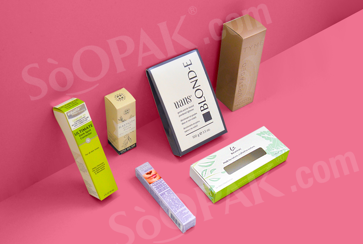
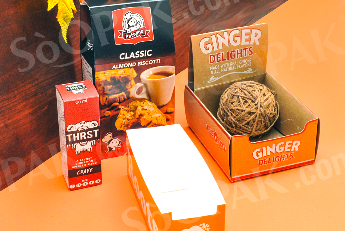
Many products lend themselves to seasonal packaging, and not just at Christmas time. Since Thanksgiving comes in the fall, you can utilize the same color scheme and many of the same graphics for both fall and Thanksgiving. The small paperboard shelf displays that hold lip balm is one product that lends itself well to seasonal changes. In fact, a good share of items that are displayed in such a manner are suitable for seasonal changes in packaging.
Color Schemes
The color schemes for fall are pretty obvious: reds, oranges, yellows, browns, and some greens, and all the shades in between these colors are the dominant ones. But don’t forget the deep blue of an autumn sky or the grays of a rainy day; the purple of ripened grapes, or the gold or maroon of late-blooming dahlias. Surprisingly, these colors blend very well together for the most part, so you don’t have to be as careful of clashing colors as with some other palettes.
Fall Graphics
Graphics are an important part of any package design, whether they consist of artwork, artistic fonts, or a combination of the two. Fall graphics can include fall-colored leaves, pumpkins, shocks of corn, cornucopias of produce, children at school or playing in a pile of leaves, a country lane lined with trees whose leaves have turned color, or baskets of harvested apples. Old-fashioned scenes lend themselves especially well to fall, such as farmers haying or long-skirted teachers ringing a school bell to call the children in.
The size of your packaging will dictate to some extent the type of graphic(s) you choose. If your product or package doesn’t lend itself to graphics, you can still do attractive things with the type on the package. If you use a heavy font, it can be filled with fall colors that slowly change from one color to another. For instance, it can start with red, fade into orange, then into yellow, back to orange, and then red again. There are also decorative fonts that have graphics incorporated into them that might be fun to use sparingly. Whatever you choose to do, don’t overdo it so that your package looks too “busy.”
Reusable
Your fall packaging will be reusable for several years until you feel you need a change. So, don’t be afraid to order plenty of packaging. What you don’t use this year will keep until next. You can also choose a design that is very autumn-inspired but still timeless if you don’t want to keep the packaging for your next fall run. This works well for those who don’t want the hassle of keeping track of extra packaging.