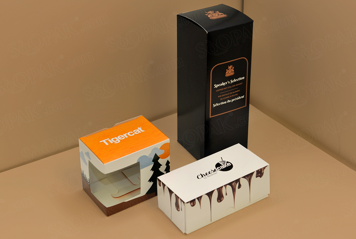
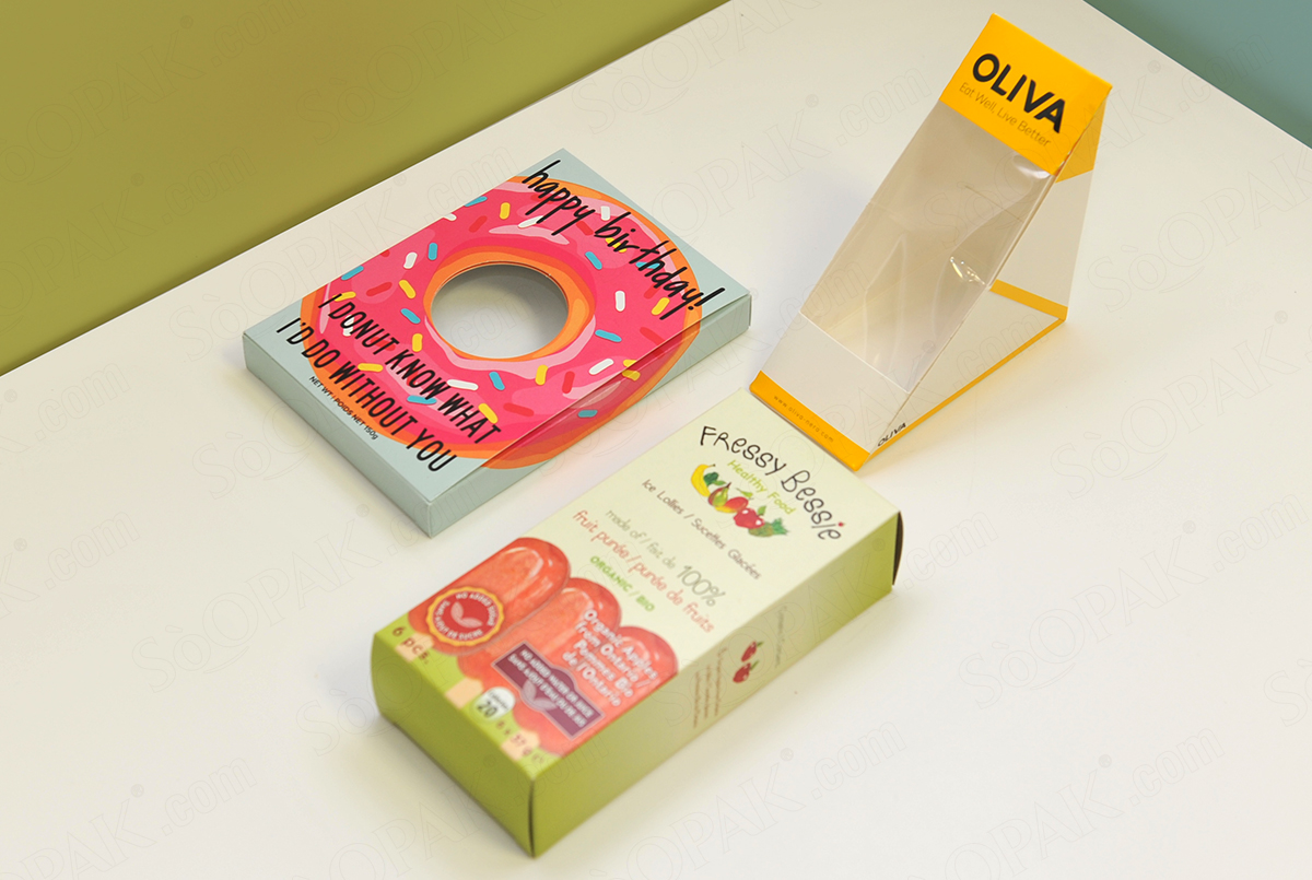
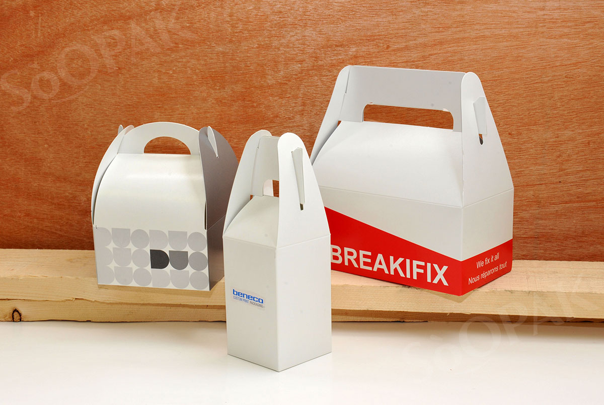
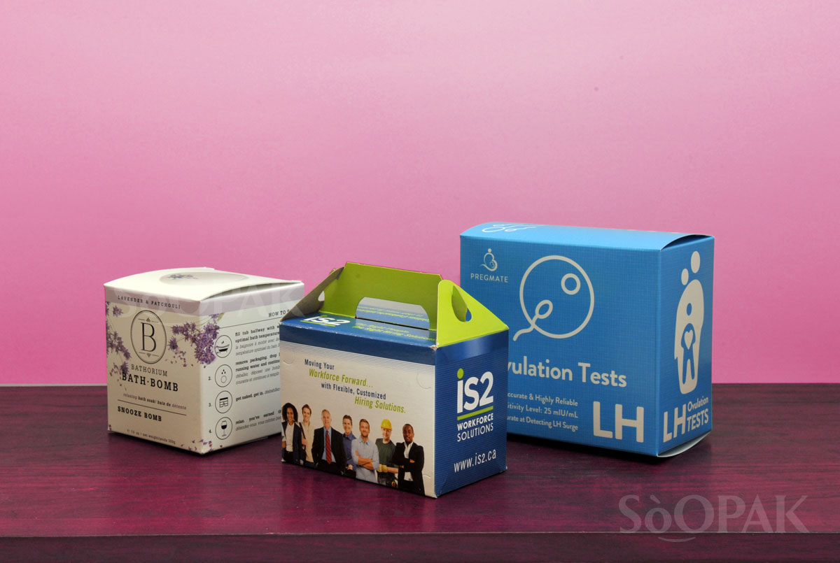
You might not realize it, but something as seemingly small as your chosen font can have a serious impact on your product packaging. Fonts will draw in your customers, and some have associations with particular fonts that can help or hurt your business. The font should match your company’s personality and make a strong impression. Here are just some of the ways it can impact your packaging.
Font Can Bring Up Associations
Over the years, various fonts have become linked to certain things or at least specific personality traits. For example, if you opt for an older typeface that seems like a classic font, this will give off the impression of prestige or something that your company has been delivering to customers for decades. Or, if you go with something sans-serif and modern, you will give off the feeling that your product is trendy, high tech, and up to date.
You Can Accidentally Overwhelm Customers
One of the biggest mistakes made with packaging design has to do with choosing too many fonts. While it is fine to have more than one font on your product packaging, you don’t want to include more than three, and you should only include more than two if you are very confident in the design. Combining fonts can work very well, provided it is done right. But, if you find yourself choosing between a font that is readable and one that is gorgeous, always go with the readable one.
It Can Hide Information If Unreadable
That brings us to another difference that fonts can make in your packaging. If you accidentally choose one that isn’t easy to read, you can make it impossible for clients to know what your product does or how to use it. In most cases, an unreadable font will simply turn consumers away; they will go with a product they can understand so they are able to use it properly.
Tips for Choosing Your Font
With a clear idea of how your chosen font can impact your product packaging, it becomes obvious that your decision should be made carefully. Readability is definitely one of the most important priorities, but there are other factors to keep in mind. This is especially true if you use two fonts on your packaging. Many brands opt for a font that is filled with personality and out-there, and this is great for getting attention and resonating with an audience. However, if you have one of these flamboyant fonts, you should always pair it with one that is subtler, as they will balance each other out. Choosing two out-there fonts will overwhelm customers.
If you know you want two fonts, consider doing one that is sans-serif and one with serifs. For those who don’t remember, serif fonts have cross-lines where the characters end, such as Georgia and Times New Roman. If you combine typefaces with and without serifs, it delivers a well-rounded and classy feel. You should also be sure never to choose two fonts that appear similar. In that case, you will do better to just stick to a single font since two similar fonts will just be confusing.


