To most people, choosing a color for something is simply a matter of personal preference. However, when it comes to product packaging and other forms of advertising, it becomes much more important. The colors that you choose to use on your product can have a significant impact on how consumers view it. Therefore, they affect your sales and brand recognition. While it helps to keep a uniform color scheme or at least brand image across your product line, you can still use different colors to convey unique information to your customers. To make the most of your design and color scheme, find out what each shade says to your consumer.
Warm and Bright Colors
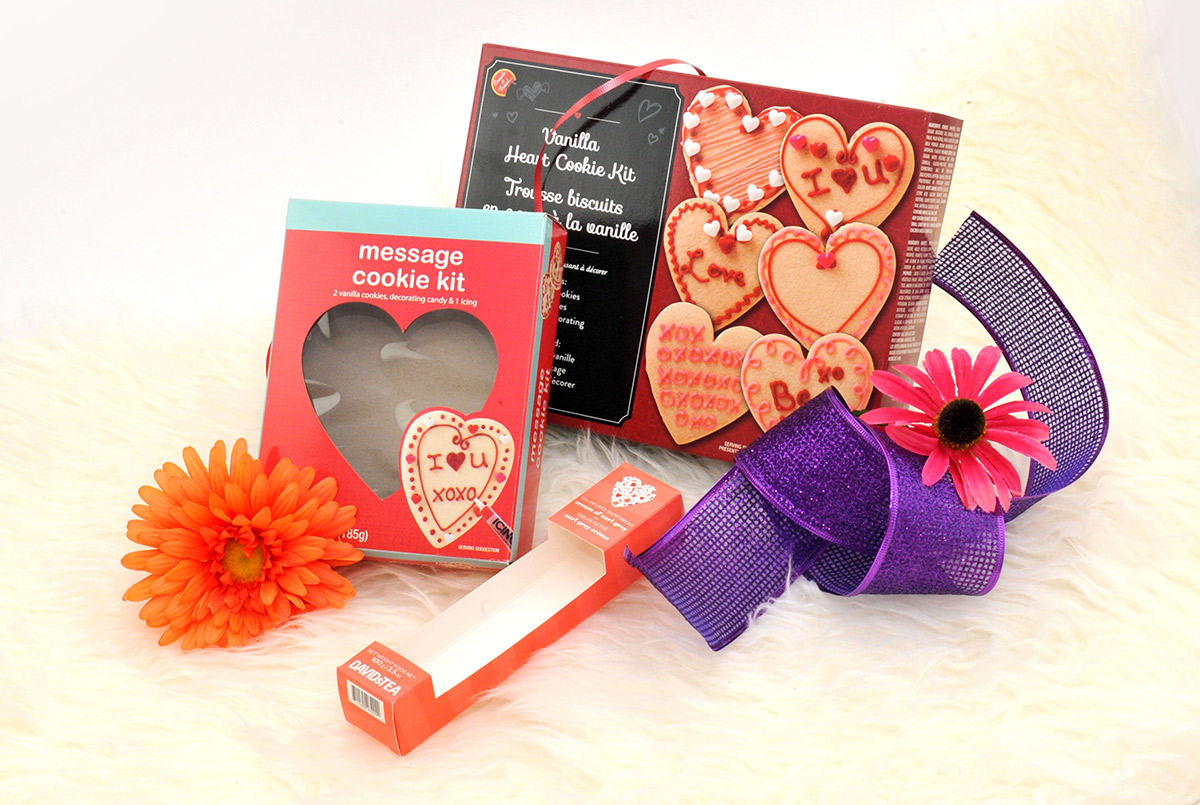
Colors that are warm and bright, like red, pink, yellow, orange, and beige, tend to be active and eye-catching. They can encourage your clients to feel energetic and courageous. These colors also make objects seem closer and enlarge objects, but they should be used in limited amounts when surrounded by shades that are more subdued because they are so visible.
Warm and Dark Colors
Warm, dark colors include shades like brown, gold, and purple, and they tend to convey relaxation, luxury, and tradition. You can use these warm dark colors for products aimed toward younger and/or rich shoppers to give a sense of elegance and expensiveness. When combined with colder colors, they can make your customers think of novelty and modernity.
Cold and Bright Colors
Bright, cold colors are shades such as silver, azure, and lavender. They create a fresh feeling and are subtle. When used correctly, these shades create the feeling of professionalism and modernity. They are particularly useful for those selling medicinal, cosmetic, or health-related products.
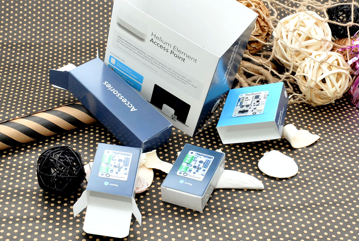
Cold and Dark Colors
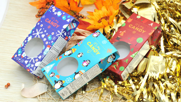
Navy, green, turquoise, violet, and blue are all considered cold, dark colors. These shades convey a sense of quality and stability to the product and are typically used as accompanying colors. You will find this type of color on business websites, but they can also be used for product packaging, particularly in computer and automotive industries.
Neutral Colors
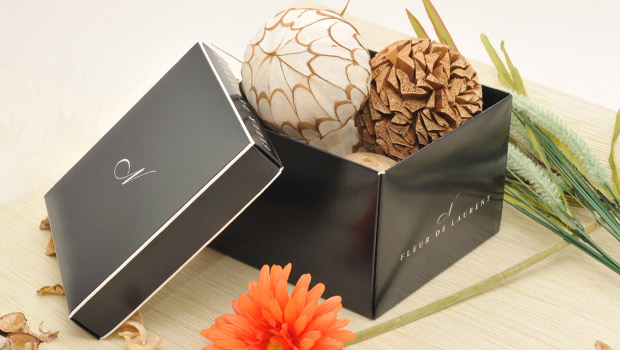
Neutral shades, like black, gray, and white, are good at complementing the other types of colors to help them convey their message better. You can use these neutrals in nearly any industry, as the other colors used tend to give the consumers a message. That being said, when used correctly, neutrals can give a sense of cleanliness, industry, or sophistication. White tends to give an idea of purity, safety, simplicity, and innocence. Black shows mystery, control, and power.
Notes on Specific Colors
Certain colors, such as blue, can fit within several of the above categories, depending on the shade used, so you have to consider whom you are targeting when choosing the shade. Older audiences, for example, tend to prefer calmer blues that are flat in color while younger people will be more drawn to products with neon or electric blues. Red is known to grab attention and give an idea of passion. It is incredibly popular for product packaging and marketing in general, as it increases the breathing rate and speeds up the metabolism, leading to impulse purchases. Green has its own purpose, typically letting consumers know that your product is environmentally friendly or healthy.
5 Tips For Getting Your Packaging Ready For The Holidays
As a business owner, you can use annual events like holidays to your benefit as a way to boost sales. The winter holidays, in particular, are…