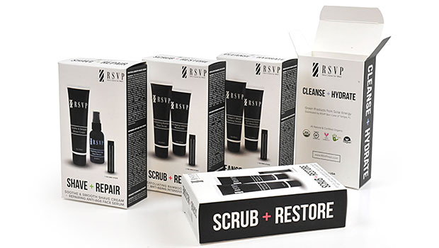
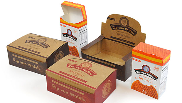
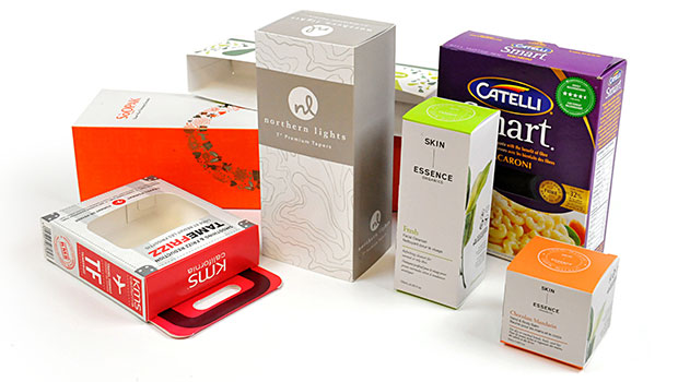
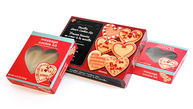
If you are thinking of using short-run packaging for the first time, then you may be wondering what you should be doing with the packaging. The first time they are packaging a product, a lot of people make the mistake of wanting to put too much on the package, because they want the customers to know who they are. Before you do that, it is a good idea to look at what the new trends are; the thing that is working now is minimalist or simple labeling for products.
Why Too Much Information Is Bad
Of course you and your small company have a story to tell, and yes you probably want to tell that story on the first contact that you have with a customer, and that likely is the first purchase. The problem with that process is that you could turn off a customer if you decide to give them too much information. Older companies can sometimes get away with it, because people already know them, but newer companies that are trying to grow their customer base would do better if they find another way to give out the information rather than on the label or packaging.
The Essentials
When designing the packaging, it is a good idea to start with the basics. The basic information that you absolutely need on the packaging includes what the product is, product name, your company’s name, and product size/weight. Having that type of labeling is perfect, but you may also have to include nutritional information, which can also be done either on the bottom or the back side to keep the clutter to a minimum. Other information that you could include (but not on the front of the packaging): your company’s website, location, and contact information.
Solid Colors
When doing minimalist packaging, it is always a good idea not to get too creative with the colors that you use. Solid colors are actually selling a lot better now, and they will also help avoid clutter that can be distracting. You should pick a color that relates to the product that you are trying to sell so that the customers can be attracted directly. Solid colors will also make the information on the front of the packaging stand out more. When the customers see your packaging, they should know exactly what’s inside and why they should buy it.
Other Things to Remember
You probably already have an idea of what the packaging should look like if you want to take the minimalist approach. Here are a couple more things that you need to keep in mind. Remember that the packaging has to be readable, and the information that you are giving should be the star. Try to have the information well centered so that the potential customer can read it better. Do not use a small font, and make sure that there is space on the sides, top, and bottom. Really big fonts can also be a bad thing.


