At SoOPAK, we care about our clients and like to make sure that everything goes smoothly when they work with us. This includes everything from your initial visit to our website or the first time you pick up the phone to the time you receive your packaging. To help make your customer experience even better, we have recently updated our website, giving it a new skin and making it more user-friendly. We hope you love the updates as much as we do! Here are some of the things you will notice.
Functionality across Devices
In the past, our website focused mainly on accessibility for PCs, although mobile users still were able to access everything without an issue. With our changes, we aimed to make the overall user experience go more smoothly so you can more easily access any portion of the website you want, regardless of the device you are using. Now you can browse our box styles or track your order just as easily from your smartphone as you can from your PC.
Adjusting the Color Scheme
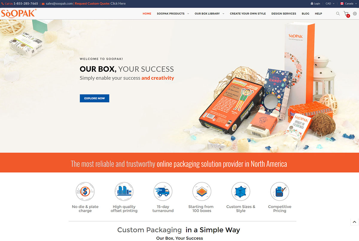
Orange has always been a prominent color on our website, as it is part of our brand identity. Even so, we took the new website as a chance to adjust the color scheme slightly and make it more visually appealing. While the old website focused mostly on an orange color in nearly all areas that weren’t white, the new one also features blue throughout. The background for the header is blue, and you will notice blue accents in images, such as our diagram on the home page showing that we print the boxes. Expect to keep seeing blue accents to complement our signature orange color.
More Images of Our Products
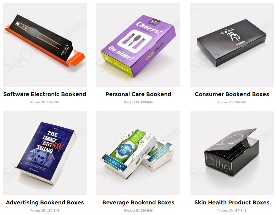
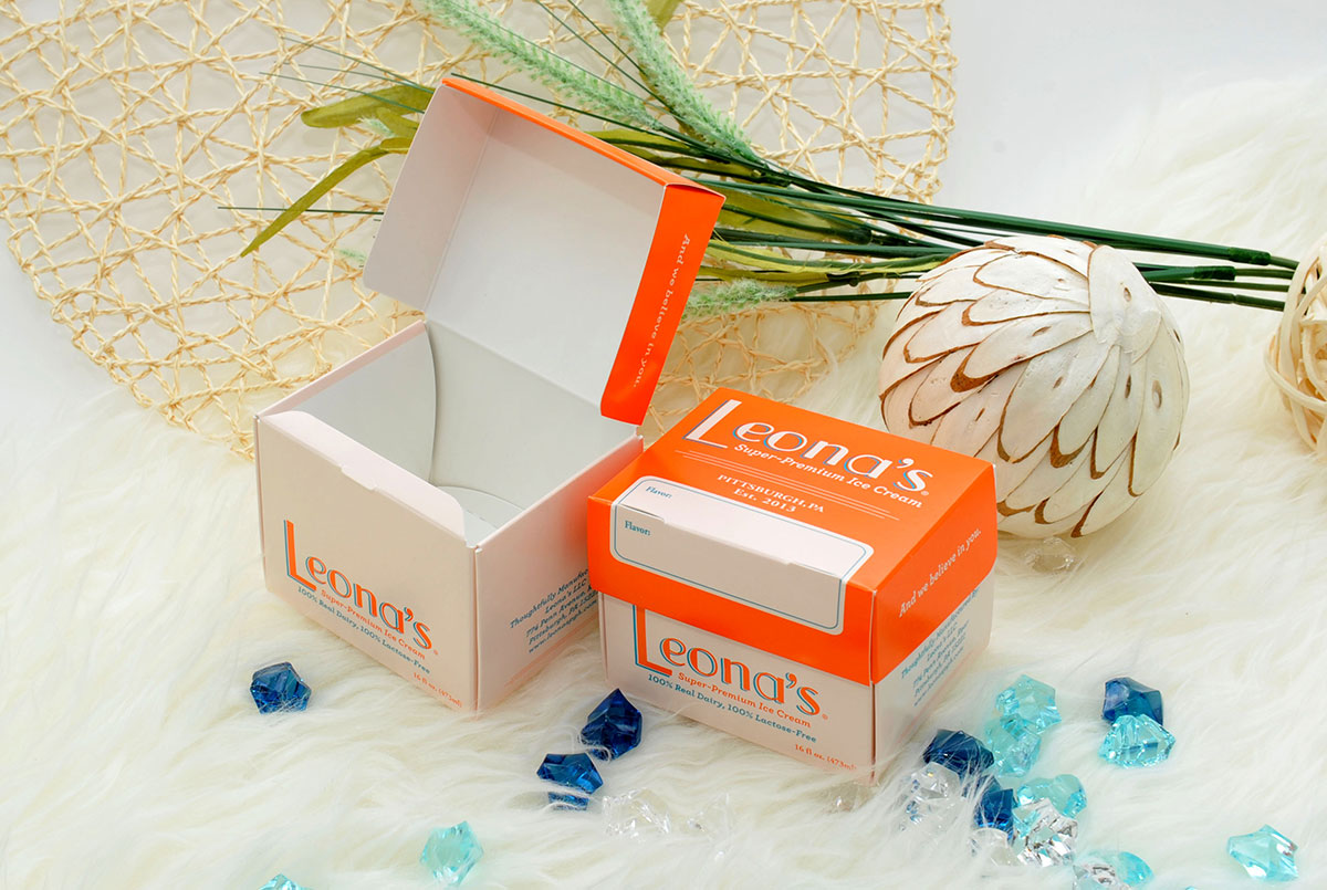
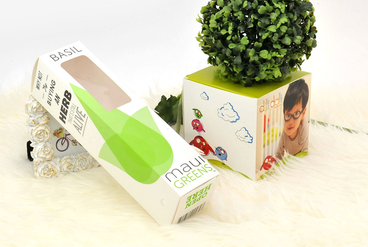
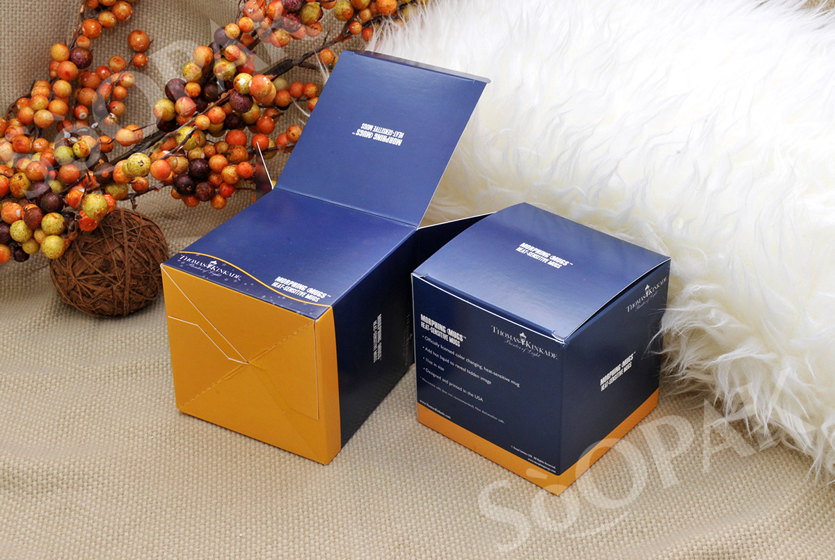
Look at the pages dedicated to our products, and you will notice a dramatic increase in the number of images. This was a conscious decision on our updated website to make sure that you know exactly what you get from each item. With the added pictures, you can easily get a feel for what exactly the product offers. There is less guesswork as to where the folds or lines will match up on the box and less time spent asking questions for clarification. Instead, you will know right from the start what your favorite box design includes and what it looks like from every angle. This way, you can focus on asking us other important questions or simply speed up the process of designing and ordering your packaging.
Reorganized Navigation Bar
We also took the time to reorganize the navigation bar in a way that hopefully makes it more intuitive to follow. Instead of a long list of industries and categories for boxes, they are divided into broad categories, like “Advertising,” “Beauty,” and “Food,” and then broken down into smaller categories. This should make it easier to find exactly what you are looking for. The redesigned navigation also includes a convenient tab for Our Box Library, where you can get a feel for the various types of boxes we offer without any hassle.
We hope that with the redesigned website, your experience working with us at SoOPAK gets even better!

