The process of designing your product packaging is crucial since the packaging is one of the first impressions you make on consumers. While things like the color scheme and imagery are important, you should not overlook the importance of typography in your artwork. Follow these tips to ensure you choose typography that can produce the desired results.
Keep It to Two or Three Fonts
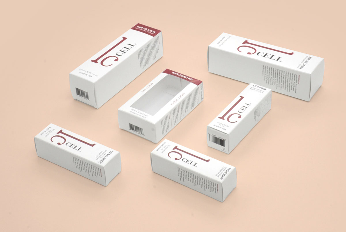
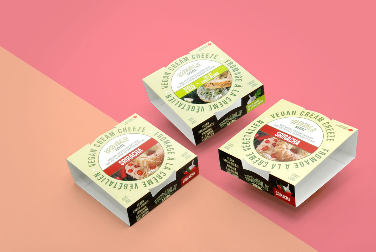
In terms of deciding how many fonts to use on your packaging design, less is more. You will want to stick to just two or three fonts as an ideal. In some cases, you may be able to get away with additional fonts, but this is rare and requires some expert designing. If you use too many fonts, your packaging may appear too busy or confusing, turning away customers. Ideally, there should be a main font you use for the product description, one for other important information and documents, and one you use for complimentary texts, at the most.
Choose the Styles Based on Contrast
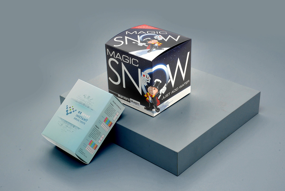
During the actual selection of the various typographies you will be using on your design, try to create contrast with various styles. The contrast can come with things such as letter size, bolding, italicizing, and capital letters. You can make subtitles and headlines by using a thick-edged version of the same font you use elsewhere. The idea is that variations in style will help make the content of your packaging easier to read.
Make It Match Your Personality
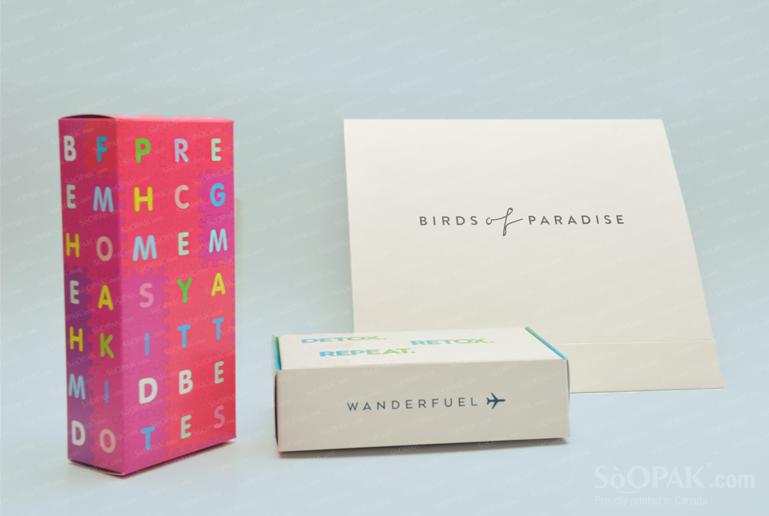
Ensure that the typography you choose for your product packaging matches the personality of the company. If you want to convey elegant imagery, for example, you would maybe consider a cursive font. By contrast, if you have a product geared toward kids and you want it to seem fun, you could use a font that appears to be child handwriting for some texts. If you are unsure which typographies will appeal to your target audience, take a look at competitors for inspiration.
Make Legibility a Priority
Although you can get creative with typography for your product packaging, you should never sacrifice legibility. After all, there is no point in having words on your packaging if consumers cannot read them. If someone feels they are missing important information because of illegibility, they will likely purchase your competitor’s products instead. Because of this, if you need to sacrifice matching your personality or something else on this list to maintain legibility, go ahead and make legibility the priority.
Understand the Importance of Typography
Another overall theme with typography is the need to understand the importance of it. The words on your packaging are how you connect with consumers and convey information about your product to them. It is also part of the visual appeal or attractiveness of your overall design. If your typography choices are not up to par, your consumers may not understand your messaging or they may get the wrong message. When done right, typography delivers information clearly and enhances the overall messaging and personality you convey with your packaging.


