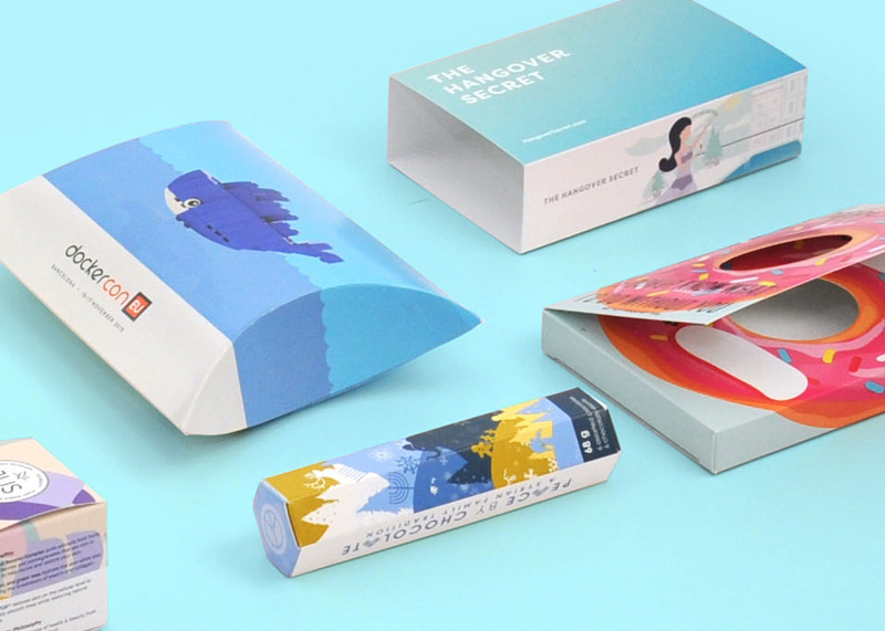
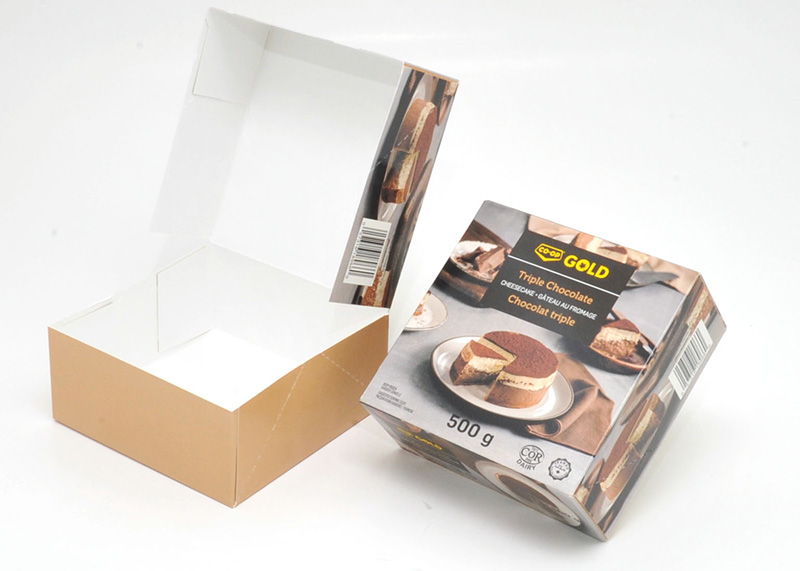
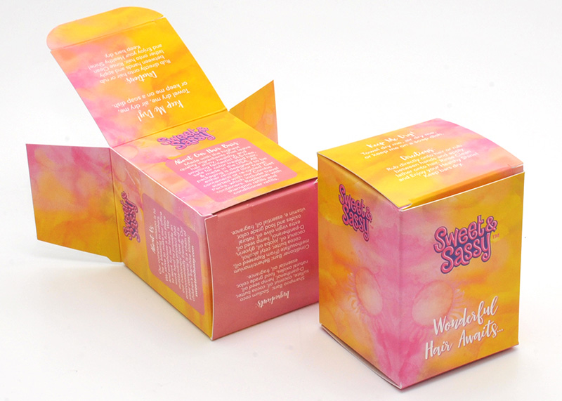
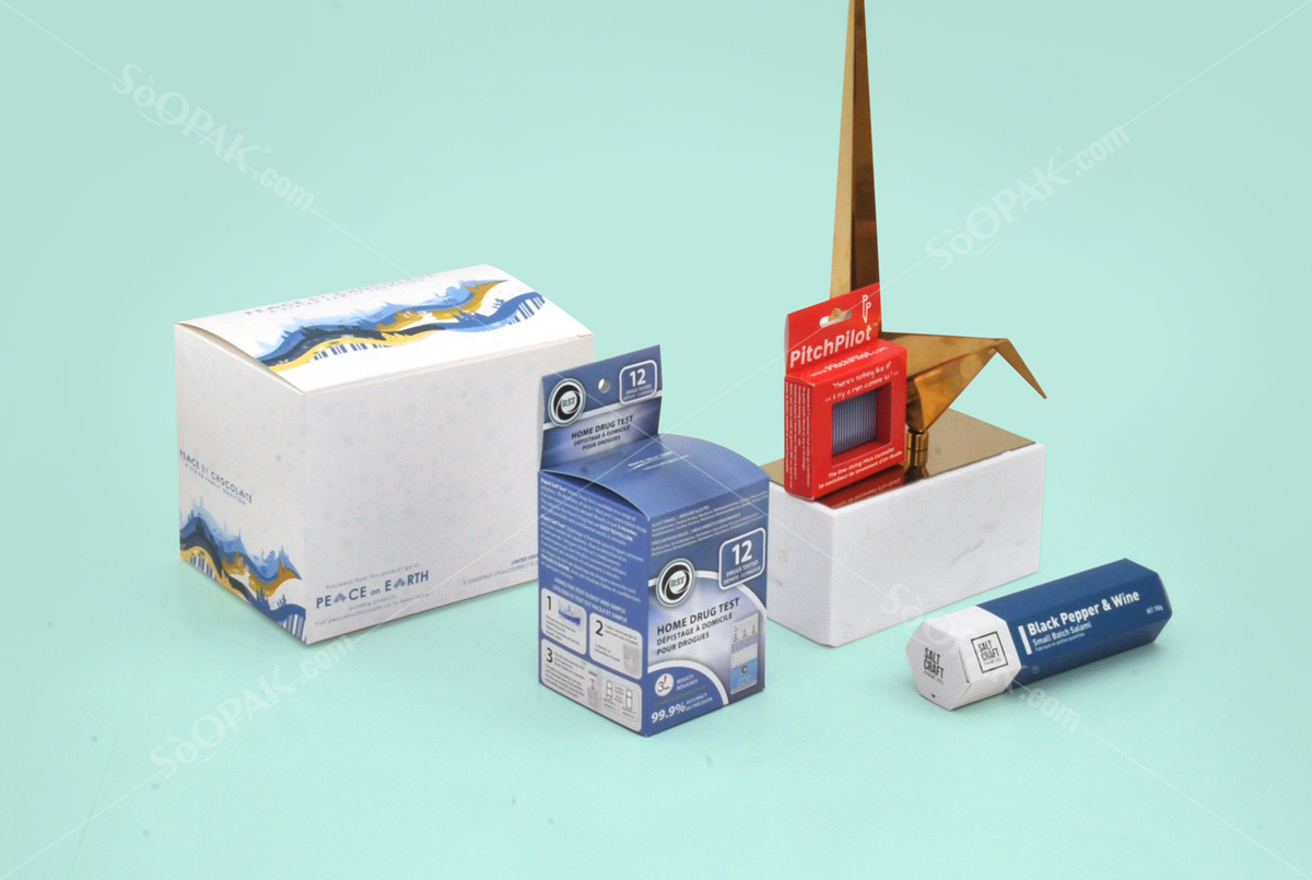
Packaging design may seem daunting at first glance, but it is not necessary. Some of the most eye-catching designs are based on surprisingly simple templates. Whether you’re looking for tips on creating food cartons, bottle labels or origami-inspired boxes, be sure to find something here that inspires you.
The packaging takes 2D designs and transforms them into 3D printed. It is an incredibly effective way of providing an intense brand look to a product or helping the consumer to commit to buying. Today, we will analyze ten professional tips to give your packaging an elegant and striking appearance, as well as technical tips to choose templates, software and print finishes.
8 features to consider when choosing the packaging
- Origami styles are not just for the Japanese
Sometimes you find a container so beautiful that it only leaves you breathless. Folded origami-inspired designs look fantastic and transform the packaging into a work of art. Many origami-inspired designs are surprisingly simple in their base and are based on carefully designed templates. Origami style food packaging tends to adapt better to display packaging. These sophisticated designs are no longer out of reach.
- Simplify packaging with Easy-Peasy labels
On one end of the spectrum of food packaging are origami-style beauties and on the other, the refreshing simplicity of an easy-to-produce label. Tags can be attached to bottles or wrapped tightly around items. They are super simple to design without folds and cheap to print, which is excellent if you have a tight budget. This does not mean that the labels have no impact: a well-designed label can bring a lovely handmade look to the packaging.
- Let your typography sell the product
Typography is a transformative element in graphic design. Choose a classic serif and create an aspiration product, or opt for a sans-serif cut in place and you are launching a product that is suddenly great and modern. Wine and beer bottle packaging provide some excellent examples of the power of typography to sell a product to a particular market.
- Consider design sample
When designing your packaging, try experimenting with different types of styles in your initial designs. Once you have done your experiment, you will feel better prepared to use the font style that best suits your target market.
- Use a natural color palette
The days of gaudy and bold packaging have come to an end. Tonal colors inspired by nature have a calming effect and take advantage of the general trend of commercial products that are more ecological and ethical. Try using brighter colored dyes to give the packaging a washing effect, or color elements of the equipment with natural brown paper or card.
- Combine photography with minimal styles
Packaging trends come and go, and one thing that is always on the move is the type of graphics that feel appropriate. At this time, illustrated graphics or simple typographic designs seem to be the most popular graphic media. Photography looks elegant and relevant if it is designed in the right way.
- Size and volume.
Depending on the product to be packaged, it is essential to select a specific size with a suitable shape that is easy to handle. Above all, its function as a container.
- Finally, the DESIGN
A good food packaging design will serve to highlight your brand over the other products in the market. The choice of colors, typography, logo and slogan and above all that the design must be creative to capture the attention.
Are you looking for the perfect food packaging design template? Take the time to browse the full range of creative templates at Soopak. We advise you from the most appropriate material for your product (whether food or not), the type of printing you need, and even how your packaging process develops. Ask us!


