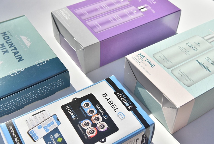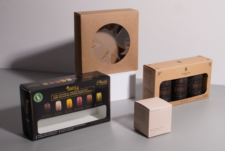
When designing and printing your product packaging, you are likely to come across the term color matching. At the simplest level, this refers to ensuring that the colors on your packaging appear how you want them to. The idea behind color matching is fairly straightforward, but it is still worth learning more about.
Understanding Color Matching
As mentioned, color matching lets you confirm that the colors used on your product packaging are what you have in mind. With modern processes, this means that it is the process of finding the colors that appear on the screen just like they will on the final packaging. Think of it as a way to ensure that the digital image you see of your packaging print will match the final printed version.
Color matching involves comparing brightness, saturation, and hue.
Factors Affecting Color Matches
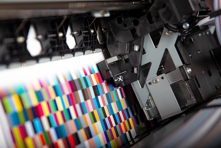
It is crucial to match colors on the screen with those off the screen because so many factors can affect how they appear. Small factors such as lighting and whether the printing is on digital material or screen-printed can all play a role. Even the lighting of the environment someone is sitting in can affect the perceived color and how well it matches.
Packaging designers know to pay attention to the curing process, the pressure, the angle, and mesh type, the screen mesh count, the material, and the squeegee sharpness. All of these factors can affect the color matching process.
Pantone Matching System and CMYK
Most packaging manufacturers, as well as those in other industries, rely on the Pantone Matching System to achieve this. Since this system is the standard for the design industry, you can use the same system globally. The system relies on a numbering system, where each color is given its own code.
The packaging designer will look at the Pantone Matching System colors that you choose for your packaging and then find the equivalent on the computer model, which is called the CMYK.
It is very common for packaging design processes to include a box for you to check whether your chosen color is PMS (Pantone Matching System) or CMYK. You can typically specify either. It is important that you specify which one you are using, as this avoids confusion. After all, you don’t want to accidentally use the color associated with a CMYK color when you meant for it to be the one associated with that PMS number.
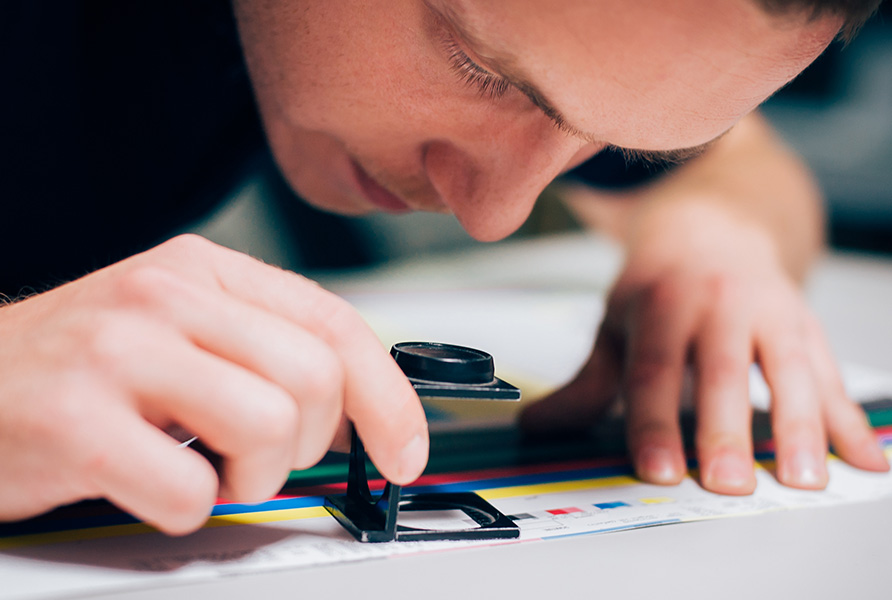
How to Get Consistent Color for Your Product Packaging
Because the Pantone Matching System is the industry standard, it is the best way to ensure that you always get consistent color from your product packaging. You can easily buy a Pantone Color Book that shows all of the available colors and numbers, allowing you to easily specify which one you want. Because it is a physical book, you can easily use it to match colors on existing packaging without an issue. Conveniently, the book also offers the CMYK equivalents for each of the shades. This makes it easy to coordinate the colors of your packaging with the colors on your other marketing materials.