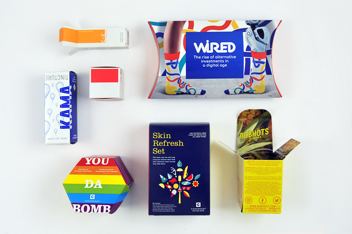
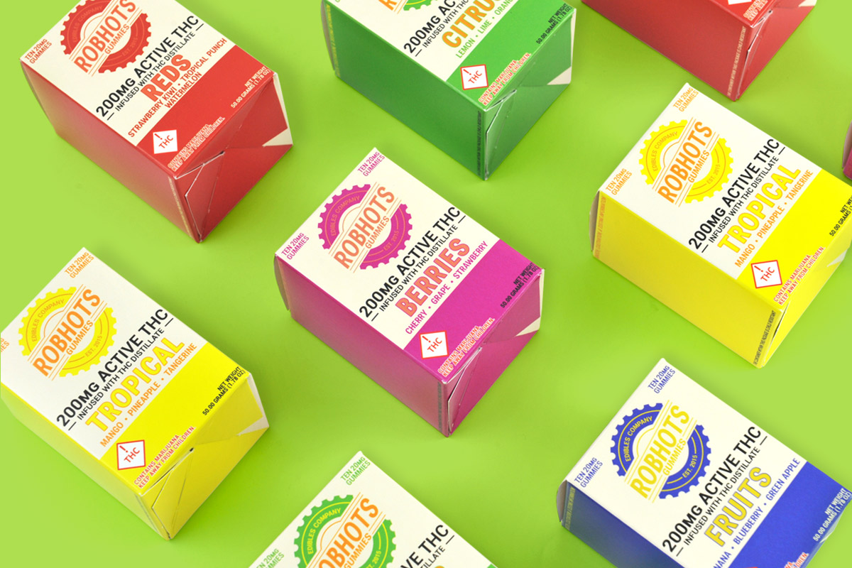
Every element of your packaging design gives potential customers an impression of your product, including the font and the color. Because of this, you need to take care when selecting the font to use on your product packaging. After all, you would not use the same font for a fun toy geared toward kids as you would a high-end wine that aims to give off an elegant feeling. Take a closer look to see what exactly your font says about your product and how to choose the right one for your product and your brand.
Serif vs. Sans-Serif
In the world of fonts, the big distinction is whether a font is serif or sans-serif. Serif fonts have those tiny decorative lines at the end of a stroke for each character. The classic example is Times New Roman. By contrast, sans-serif fonts do not have these decorative lines and include many other common fonts, such as Arial.
Most people have an unconscious distinction in their mind between serif and sans-serif fonts, linking serif ones to classic products or those that are older. Serif fonts are also the best choice for any extended block of text since our eyes do better reading them. By contrast, sans-serif fonts can work better in low resolution, which is why you will find them in many digital uses. In terms of design, they give off a feeling of cleanliness and modernity.
In addition to the general differences in impressions of serif and sans-serif fonts, there are also variations within each category. For example, a thin sans-serif font may seem noble and glamorous, while a thicker one gives off the impression of masculinity or a hard worker.
Slabs, Scripts, and Decorative Fonts
The other major categories of fonts that you can use on your product include slabs, scripts, and decorative fonts, with each typically saying something about your product.
Script fonts are those that look like cursive or handwriting, such as those found on formal invitations. Including them on your product packaging gives off an air of femininity or a high-end, elegant feel.
Slab fonts use blocky serifs, such as those found on old typewriters. If you use them on your product, you will be telling potential customers that are old-school or nerdy. They tend to be best-suited for shorter texts, such as a header or logo, instead of a longer block of text.
Finally, decorative fonts are highly stylized in nature and will grab attention. They must be used sparingly since they can either make a good impression or a very bad one; Comic Sans fits into this category. Decorative fonts will convey a different message about your product depending on which one you choose, but they are best handled by a professional designer and should always be used in moderation.
Choosing the Right Font for Your Product
When it comes to selecting the right font for your product packaging, you will need to take a great deal of care and do your research. Look at the fonts competitors use and see what associations people have with a particular font before you select it. Ideally, you should hire a graphic designer to work on your packaging’s artwork since they will already be familiar with what various fonts would say about your product.
