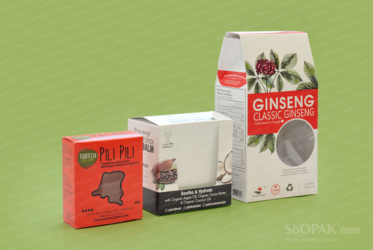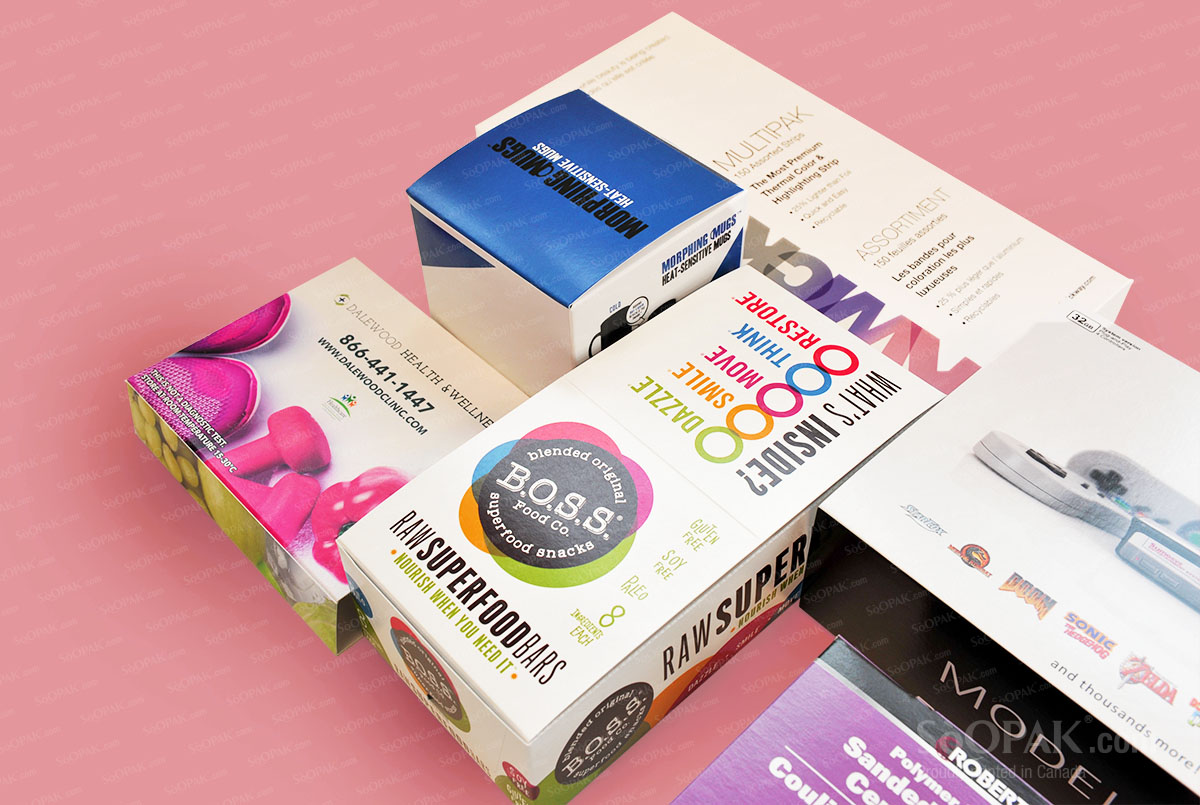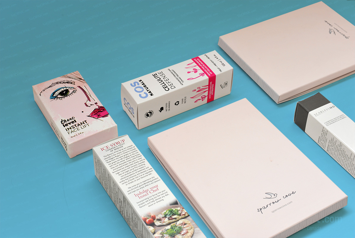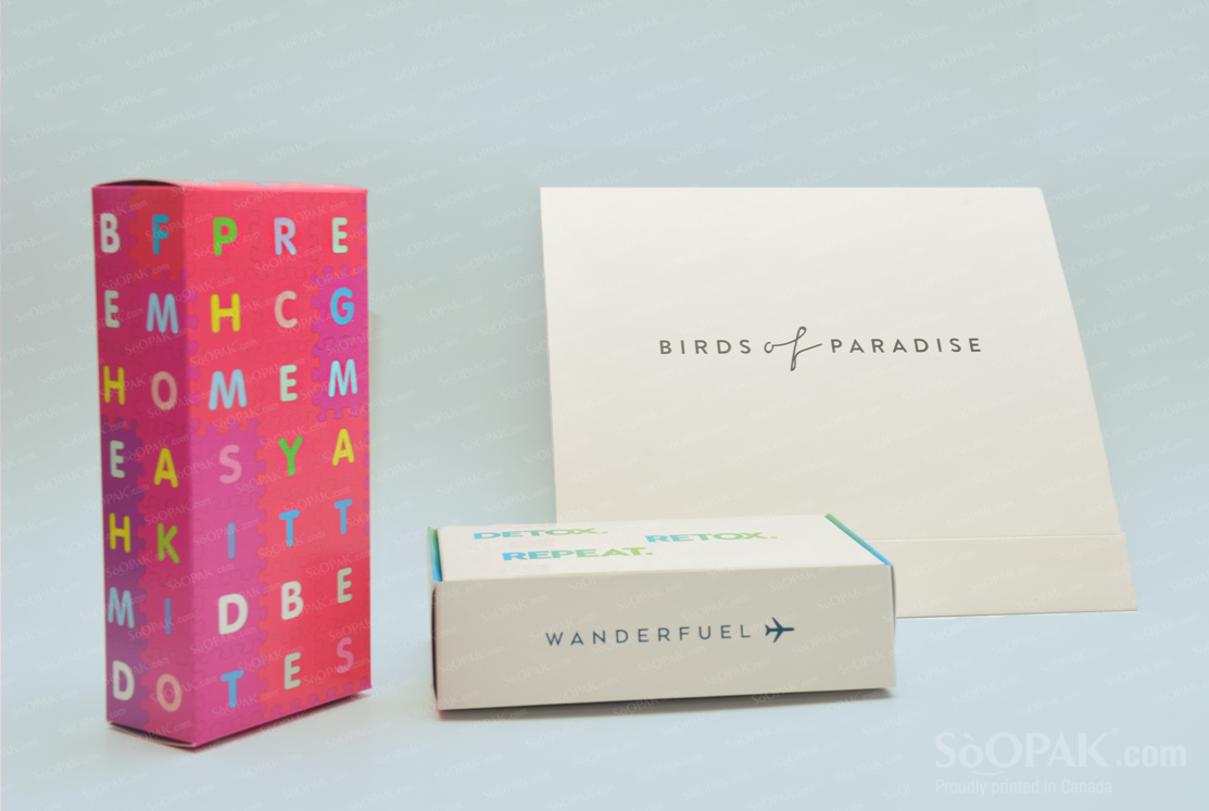
Font is just one of many elements of your product packaging, but it can make a major difference in whether your product flies off the shelf or sales crawl along. Typography is a crucial part of the design, with various fonts and typefaces conveying a different impression for those who view your product.
A Quick Overview of Fonts
When looking at the fonts for your product packaging, you will need to keep in mind that there are hundreds of options available, but most can be divided into two categories: serif or sans-serif. Serif fonts have those small lines or “feet” at the end, and many designers (and customers) feel that they give off a more traditional, serious impression. Sans-serif fonts do not have those extra lines, and they tend to give off a streamlined, modern impression.
In addition to these divisions, there are also scripts, which are in the style of handwriting or cursive, typically with connected letters. Despite the common features, there is a range of scripts, from fun to hand-drawn to elegant. Finally, you will find display, decorative, or novelty fonts, which are there to pull in attention. Those are best in small doses since the average person will avoid products with too much text that is hard to read, as decorative fonts typically are.
Why Font Matters
Just like a part of your personal appearance or style, such as your wardrobe or haircut, says something about you, the font you choose says something about your product packaging. Certain fonts are viewed as appropriate for certain settings while others are not. For example, most offices stick to serif fonts for official documents, instead of something like Comic Sans, which would seem inappropriate.
Examples of Fonts and Their Ideal Uses
Now, you can get an idea of some of the more popular fonts and what type of impression they give off to potential clients. Engravers Gothic is a nice, elegant font with clean, classic styling that will do well on high-end products. Chennai, by contrast, is cute and fun, giving off an impression of girliness to some extent. That being said, it can be used to create a fun and friendly appearance. For those in search of something more serious, look at the font called Jane Austen, a script. This can add texture to a design and convey the idea of being classic or traditional.
Tips for Choosing Fonts
When selecting the font for your product packaging, keep in mind that this is a type of advertising, so you want to convey the proper impression. A talented graphic designer can guide your search, but you should still be familiar with some basic guidelines. Opt for only two or three fonts, as otherwise, it can become overwhelming for potential clients. If you feel too limited with just a few fonts, make your typography stand out in other ways, such as with bold or italicized sections or even having several different font colors. You should also opt for something that is easy to read, yet still fits your product’s style, whether that is fun or elegant.