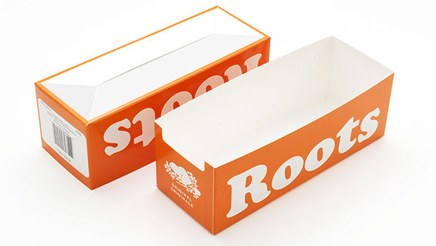
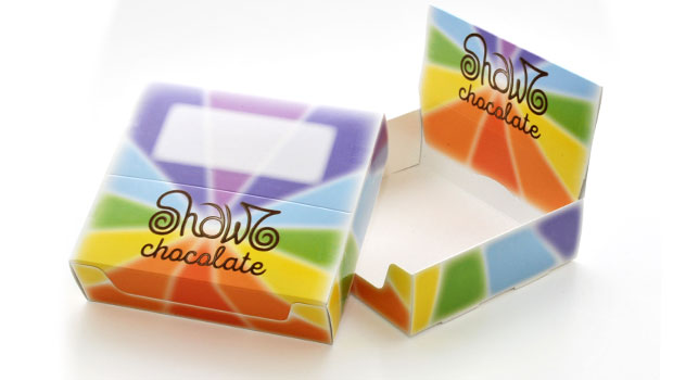
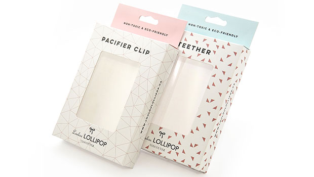
An attractive package is more than just a pretty box. Not only does your packaging need to contain your product in a safe and sensible manner, it also needs to look attractive and stand out so that potential customers will notice it and be compelled to pick it up. One very important factor in designing your packaging is making sure that your logo and the packaging work together. There are several ways to make this happen.
Logo or Product
Your logo is your company’s identity. When you create a new package, how do you want the logo to appear on the package? Are you promoting the company’s image, or are you promoting the product? We are all familiar with logos that are so recognizable that we don’t even need to read the wording that may be on them. Sometimes the packaging is the logo. Think of a box of crayons. What do you see? A generic brand from the dollar store? Or a yellow box with green lettering and design? A well-known logo is often prominently displayed on the front of the packaging, especially when the company runs on its reputation. If you choose to downplay the logo and feature the product instead, be sure that your logo is integrated into the design so that it will become instantly recognizable. That way, you will establish a presence in the overwhelming merchandise market.
Size and Shape
The size and shape of packaging you choose are dependent upon the size and shape of the product. However, you may have a little flexibility. You may be able to enlarge the packaging just a bit in order to accommodate the logo. You won’t want to enlarge it much, though. If you want the logo on the front of the package, you will need to be aware of the shape of the logo and how it will fit on the shape of the package. A properly sized logo put in the right place on the package will make an easily recognizable product.
Color and Design
Here is the major factor in making certain that your logo and your packaging work together. If the basic color of your logo is red, don’t make your packaging pink. Instead, choose a color for the package that compliments red. A white background is very often a good choice if your logo is to be the focal point. Make the logo the bright color and place it on either a white background or a much lighter shade of the same color. If you are consistent with the color of the packaging, it will be as recognizable as the logo is. Remember the crayons.
Typography
Be sure that the typography that you choose for the logo works for both the product and the packaging. Typography can make or break a logo/package design. So hire a professional graphic artist to produce the best logo/package design possible.


