Your choice of products in your product packaging is a sensitive but often overlooked aspect of marketing and perception. While proper colors leave a lasting impression on your customers and help your brand stand out from the pack, wrong colors, on the other hand, confuse customers and can ruin brand perception.
Similarly, certain colors work great for specific industries but are terrible for others. To help you determine which colors work best for which industry, we’ve compiled a list of colors you should avoid with your packaging.
Bright Colors for Professional Services
Avoid bright colors if you offer professional services such as financial, investment, and legal services. While bright colors are cheery and encourage optimism, they might send the wrong message about your business in the financial and legal industry.
Instead, you should use neutral colors like browns and grays, denoting seriousness and professionalism. Alternatively, you could use dark blue to show trust and trustworthiness.
Unnatural Colors for Natural Products
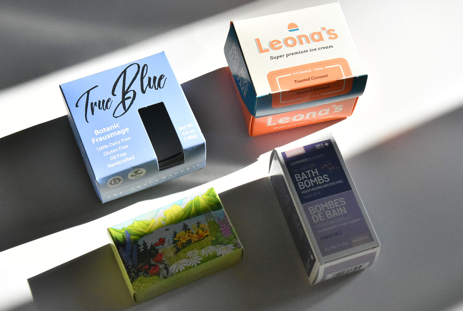
It’s best to steer clear of unnatural colors if you want to emphasize your product’s organic and earth-friendly qualities. Using colors that don’t occur in nature diverts from your bottom line and gives the wrong impression. Examples of such colors include pink, purple, cyan, and magenta, among others.
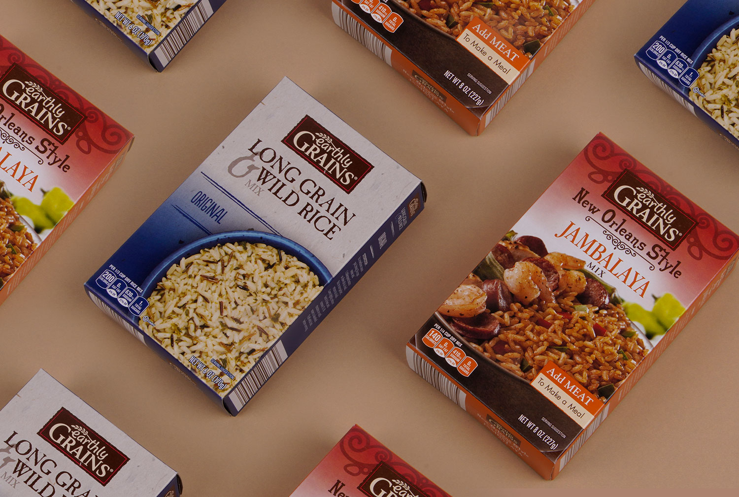
For natural products, you should use colors that occur in nature. It’s hard to go wrong with green and white for dairy products. You can also use green and brown for earth-friendly, sustainable products to distinguish them from non-sustainable counterparts and attract the right audience.
Unnatural Colors for Food Products (Except Snacks)
You’ll also want to avoid colors that aren’t found in nature if you sell fresh food and ingredients. However, you can use them for packaging snacks like chips, soda, and candy bars.
Stick to brown and green for fresh foods and ingredients, especially herbs and spices. Alternatively, you could use the same color as the food you’re offering for better relatability. Artificial colors work great on snacks and fast food packaging.
Weak Colors for Bold Products
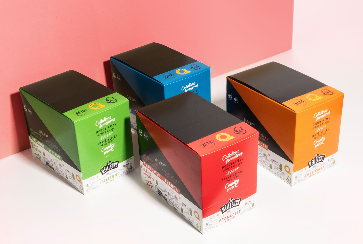
The loudest colors always win in markets like beverages, sports, baby products, and others. Loud colors include bright orange, yellow, fuchsia, and most other artificial. Using weak colors, specifically neutrals, will work to your disadvantage by making you less competitive.
Your packaging should be just as bold if you offer bold products. Think along the lines of deep reds, bright yellows, and artificial colors. You can also mix a few bright colors for the greatest effect; just don’t overdo it. Top it off with bold lettering, and you’re good to go.
Right Colors for the Right Impression
The colors you choose for your packaging should relate to your product offering and particular niche. And while creativity is a bonus, be careful to stay within reasonable limits to avoid sending the wrong message. Remember your packaging colors and font should align with your brand identity and culture.
You can always borrow a leaf from the competition as long as you don’t copy everything from top to bottom. If you’re not as creative, you can work with professional marketers so they can turn your vision into reality.


