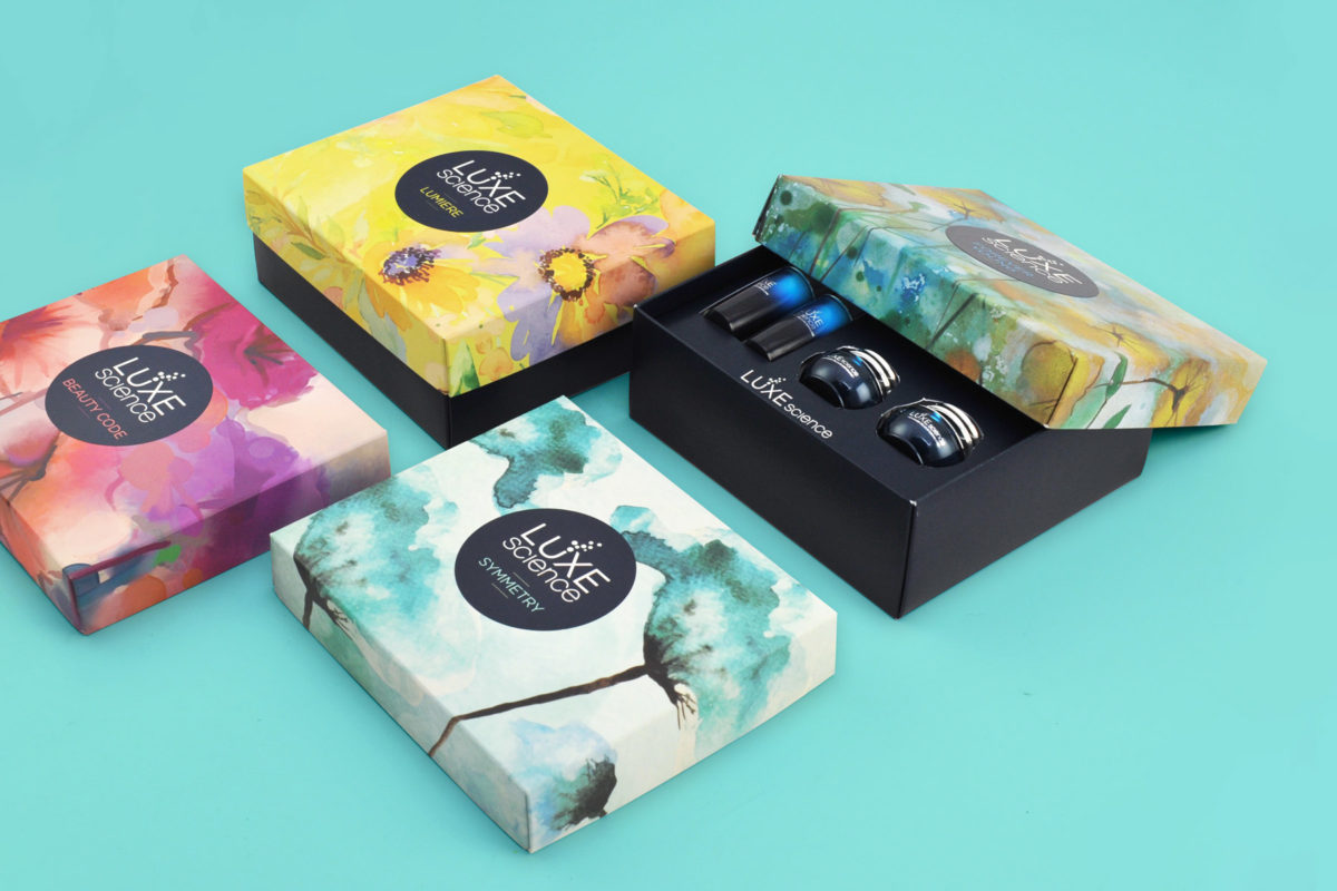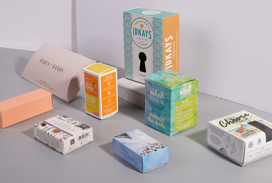
You should never underestimate the impact any element of your packaging has on your sales, including the color. Color is actually among the most important parts of your packaging; it’s one of the first things customers notice, whether you sell household items or something else. Remember that color is associative as well as evocative, invoking reactions and emotions in people. The average person will react to a color before they take in anything else. Take some time to learn about the key role color plays in your packaging and what you can do to take advantage of this to boost sales.
General Tips for Selecting Your Color
When it comes time to choosing packaging color(s), try to keep it simple as you do not want to overwhelm potential customers. At the same time, try to using contrast to make colors noticeable without being overpowering. Don’t forget to keep your audience in mind. Know which colors will appeal to them and what they are unlikely to like. To achieve this, pay attention to what different colors convey and the psychological effects of various colors. You should also be aware of any cultural references linked to the colors you select. As you choose, don’t be afraid to try out different colors to see what works with your product.
Understanding the Uses of Specific Colors
As you begin to consider which colors to use in your packaging, pay attention to the meaning and uses of each particular color. Yellow, for example, is the color that the brain processes most quickly, which makes it good for grabbing attention. Yellow also conveys the image of optimism and youthfulness. In color psychology, orange is persistent and aggressive, creating a call to action. Red gives off a sense of urgency and energy, increasing the heart rate. This color is frequently associated with clearance sales, making customers associate it with good deals.
Green is linked to relaxation and wealth and is the easiest color for our eyes to process. Black is typically found on more luxurious products as it is sleek and powerful. Blue delivers a sense of security and trust, which is why it is commonly used for the financial market and banking. Pink is associated with romance and femininity and is typically reserved for products marketed towards females. Purple has a calming, soothing affect and is common for anti-aging products as well as general health and beauty items.
Color and Branding
The color of your packaging is also a key component of your branding. To increase sales, you need to increase brand recognition: Creating the ideal color scheme and then using it is a perfect way to do so. In fact, some statistics say that 80 percent of a customer’s brand recognition is due to color. Remember that the easier it is to identify your brand, the easier it will be for repeat customers to find your product. This brand identity via colors will also make it easier for those who try a product and love it to find more from your company.


