


Every manufacturer knows that packaging is advertising in miniature. A perfectly great product packaged poorly is not as likely to sell well as if it were packaged smartly. Using the same package design year after year has some merit, as people get accustomed to the design and can spot your product on the shelf effortlessly. Take, for instance, the Quaker Oats container. It has looked essentially the same for decades. However, small changes are made periodically to update the design and keep it looking fresh, yet familiar. The New Year is a great time to freshen up the look of your packaging.
Analyze Your Current Design
First, analyze your current packaging design to determine what the strong elements are and what can be improved upon. Has your product been around long enough to have an established identity? Has your packaging remained consistent enough to be instantly recognizable in the marketplace? Is this a newer product? If so, has the current packaging proved successful, or does it appear invisible on the shelf?
Choosing the Design
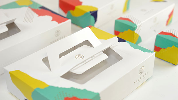
When you have completed analyzing the packaging, it’s time to brainstorm some fresh ideas for the design. You don’t want to be a copycat, but it’s a good idea to spend some time in a variety of stores, looking at the packaging on products that are similar to yours. It’s also helpful to look at packaging in general. Your product may be a box of pancake mix, but you may find pleasing and adaptable elements of design on a box of Legos®.
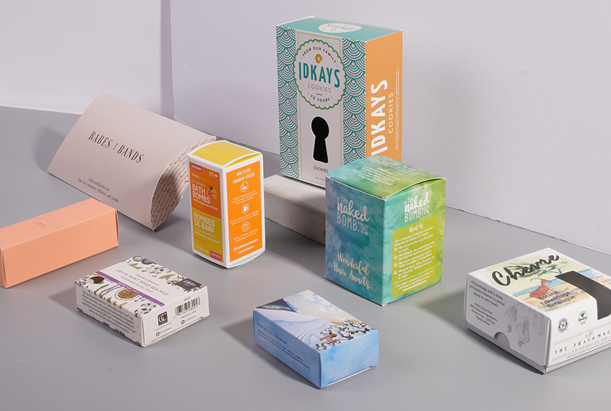
Color
Color is a critical element of design. Make sure that the color(s) you choose are appropriate for the product. For example, you probably don’t want to make brown the dominant color on a package of toilet paper. Choose one or more colors for the typography that will match or complement the color of the product. If you are packaging a small space heater that comes in a shiny red and you have a picture of the heater on the box, don’t use orange for the package lettering.
Colors that are bright and eye-catching are great for certain products, such as toys or cereal boxes. But prettier, more subtle tones are more attractive for women’s skin care products. Bright, garish colors insinuate “cheap” on a product that you wish to promote as classy.
Typography
Choose your lettering carefully. You don’t want to use a chunky typeface on a small box containing elegant perfume; choose a classy typeface instead. A readable script font is nice—but never use all caps when using a script typeface. It not only looks awful, unprofessional, and tacky, but is very hard to read, too.
Use an easy-to-read typeface, and don’t use more than two or a maximum of three typefaces on any one reading surface. You can use one font and bold or italicize it to change the look. Also, make certain that the two typefaces you do choose look good together. Generally, use one script and one plain, or one serif and one sans serif.